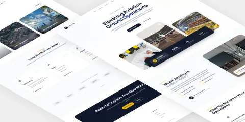
Taax: High-Converting Landing Page
The landing page for Taax was suffering from information overload. We focused on a minimalist UI redesign that clearly communicates value and guides users to action.
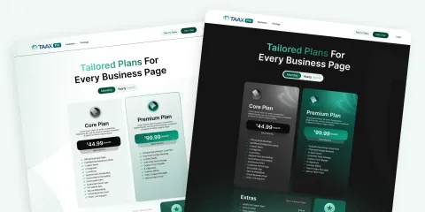
The Challenge
The landing page for the Taax website was suffering from 'information overload.' The interface was congested, making it difficult for users to understand the core value proposition or know where to click next.
Our Solution
We focused on a Minimalist UI Redesign for the landing page. We used Visual Hierarchy with size, color, and typography to guide the user's eye to the most important information first, Space Optimization by removing unnecessary elements and improving padding/margins to let the content breathe, and Call-to-Action (CTA) Focus by redesigning the CTAs to be prominent and clear.
Visual Showcase

"The new landing page clearly communicates our service within seconds of landing. The congested look was replaced with a sleek, modern interface that builds immediate user confidence. Our conversion rates have skyrocketed."